


Are you ready to explore a complete digital marketing guide? What is Digital Marketing? Why Digital Marketing? Who is a
Are you worried about your website? Is your website traffic down? Here is how you investigate! Push on to know
Designing Landing Page and Marketing campaigns are an amazingly powerful way to generate leads. Landing pages make it easier to
Are you Owning a website and not Maintaining it? We all know the importance of owning a website if not,
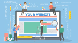
Website Creation Need a website for business? Websites are the Internet face of your business. Many like to have an

Are you looking for ways to reach more customers and grow your business? One often overlooked way to do this


